As I wrote in last year’s blog…it is very difficult to decide on the book cover. After all, the book IS judged by the cover. Maybe you buy the Quilt National book every time for your collection of Quilt National books, but I can’t bank on that. I have to make an appealing cover to convince someone to first, pick up the book; second to look at the back cover and third, to browse through the book to see if they want to buy it. Sometimes I only get the first of the three (if the cover appears in a catalog or online) and so the pressure is great!
We-myself, my graphic designer and Kathleen Dawson, the director of QN- tried to pre-select possible quilts that we thought would make great covers. As I said, we didn’t want a turquoise one so it would look different from the last book. We didn’t want to feature one artist too often. We wanted a colorful cover so a black quilt would be out/sorry to the most gorgeous black quilts I’ve ever seen (but it did make the back cover)! And the same for the all white quilt- but it did make fantastic end papers for this book!
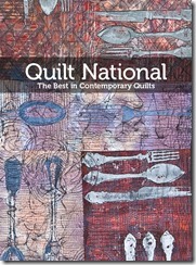
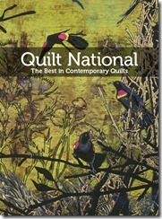
The choices were photographed and then they were cropped and put into mock covers for all of us to see. We tried the Best of Show as we thought it deserved a cover but it didn’t work well due to the many small pieces. It was very difficult and there was no consensus on the first round so more had to be created/much more than the 3, I initially wanted to have!
Please note that this blog is very difficult for me to write because I don’t want to hurt any of the artists’ feelings but I thought it would be interesting to explain our process…which is totally objective. All the quilts are remarkable works of art but we three had to give it our best educated opinions and ONLY pick ONE!
One of the quilts that wasn’t suggested, but I thought looked terrific, with high graphic impact was this oil rig, however I was outvoted.
Without commenting on why these did or didn’t make the cover, because frankly I don’t know all the reasons, I am showing you what we had. YOU be the judge! Let us know if you agree with our final selection or if you have a strong opinion on another cover.
It was not easy to get a consensus and there were others involved, but we were all very happy with our choice of Marianne Burr’s, Through The Lens. We liked seeing the hand-stitching close up, the transparency of the fabric and the colors with the lime title band plus the pleasant disc shapes and it was unique from past covers.
So, after finally deciding on the front cover, we had to then work on the BACK one!


I very much like your choice as it is quite different in flavor than the others. Very bright and probably going to catch not only quilters, but those who do embroidery.it is really quite impressive.
ReplyDeleteWhen I first saw the cover art for this year's catalog, I wondered why in the world you would pick that - a real miss, I thought. Now that I see the others that were considered, I feel even more firmly that you missed the mark. Almost any of the other choices would have been better for a variety of reasons. If it were my choice, I would opt for either the oil rig or the last one in the 2nd row.
ReplyDeleteI think the Idaho Beauty and I may be telepathically linked. I agree 100% with her choices and was just going to write my comment when I started to read hers. Imagine my surprise!
ReplyDeleteSo...what she said. couldn't have said it better.
That said, I know that making the choice is probably a much harder job than we can imagine so you have my admiration and respect for the job that you do. Thanks!
Agree with whichever chose or would have chosen. Like the fact you sent it was hand quilted, takes it up a notch. As a machine quilter I feel I have the right. Am in Awe of those who hand quilt. Now when and where do I buy a copy?
ReplyDeleteWWW.DRAGONTHREADS.COM
Deletelooks great,, would like to have your blogs pop up on my vivianhelena@sti.net, email, and blogger has a "Follow" that is easier to sign up on ... I have it on my blog... prefer to have my other email rather than my Google account. Love looking at the books.
ReplyDeleteYou did a wonderful job on that book cover quilt. Color and clarity of seeing the quilt block(s) was a set of my criteria. Good work!
ReplyDeleteLike them all....but the Oil Rig would have had my vote...
ReplyDeleteI would have picked the Oil rig or the first one in teh last row. However that is just looking at the choices, and liking bolder graphics.
ReplyDeleteThe one you chose is very appealing and does make me want to pick it up and look, so well done. It is hard to set just the right tone and appeal for a whole book of art all with one image.
All of these different covers would prompt me to want to find out more about the contents of the book. I think that you have done a wonderful job.
ReplyDeletePhD by Publication by Annie adam
Wow, I missed this post! I am honored that my quilt was in the running. I love seeing these mock ups, and to me, they all look great. Love Mary Ann's work, and it makes a really stunning book cover. Thanks for having 'Grandmother's Dresses' in the running.
ReplyDelete