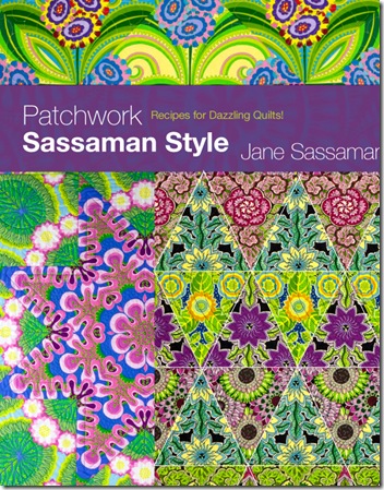
Sometimes it is easy to design a cover, but not for this book!
When we did Noriko Endo’s book, there was only one quilt where we could get a large, high res shot for a cover bleed so that was no worry! 
But here we have so many quilt photos to choose from which makes it more difficult. What should the cover convey? How can the design grab the reader?
The book is NOT patterns using Jane’s fabrics but is more involved. It shows how to use large scale personality prints in a collection to create dramatic quilts with little piecing. We do use Jane’s fabric solely in the book but explain how to create these same graphic looks using any other fabric collections….so is it necessary to show this on the cover or save that for the back cover? Should the cover just be so beautiful that the quilter picks up the book to read the back cover and learn what is inside the book? But what if the book is in a catalog where the quilter can only see the front cover?
Of course you know that every book IS judged by the cover! It’s one of the most important parts of the book creation. Our aim is to sell books after all. So as you can see, it is a complex decision.
As promised, here are some cover ideas. Please vote for your favorite one in the comments using # 1-6…THANKS!!


#1 and then #5 a close second...
ReplyDeleteNo question - #1
ReplyDeleteNumber 5 although it's hard to choose one.
ReplyDelete#1, absolutely. #5 is also good, but not so striking. The others look ordinary by comparison.
ReplyDeleteAbsolutely #1! #5 is strong too, but not as strong. I would make the subtitle a bit more prominent (size and possibly contrast). I expect to be selling a lot of these, so it truly matters to me. :-)
ReplyDeleteI have changed my mind. I vote for #5 because it is more refined and the black provides much better contrast for the title and author. I would prefer the subtitle to be a little larger and easier to read.
ReplyDeleteI agree that #5 is my favorite, and the subtitle needs to be larger. All are tempting!
ReplyDelete#2 I like the floating frame as an overlay emphasizing Sassaman and the subtlety of the tilted orderly square.
ReplyDeleteIt was no. Five for me.... I knew it right away!
ReplyDeleteVery sophisticated with black.